
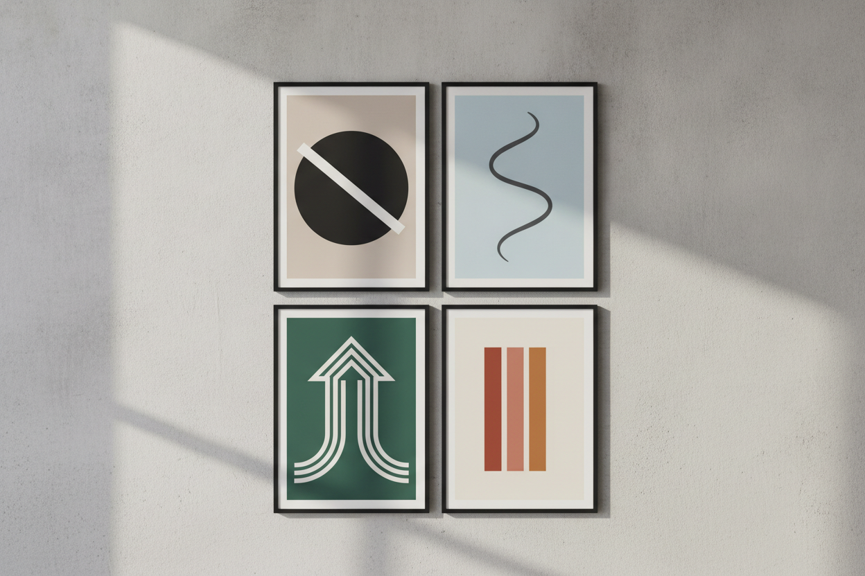
Minimalist poster design is all about clarity. When you remove unnecessary details, the message becomes stronger and the composition has room to breathe. This style works especially well for art prints, event posters, and personal projects because it combines visual restraint with a polished look. The challenge is to make less feel intentional rather than empty.
Typography often carries the design in a minimalist layout. Choose a typeface that matches the tone of the message, then give it enough space to stand out. Size, alignment, and line breaks all matter. A small adjustment in spacing can dramatically improve the balance of the whole piece. In minimal design, every decision becomes more visible.
Color should be used with care. A limited palette often creates the cleanest effect, especially if one accent color is used to draw attention to the most important element. Neutral backgrounds can make text or shapes feel sharper and more refined. You do not need many colors to create visual interest; contrast and placement can do most of the work.
It also helps to think about hierarchy before you start. What should the viewer notice first, second, and third? Once you know that, the layout becomes easier to build. Minimalist posters succeed when the eye moves naturally through the piece without confusion. The result is a design that feels modern, calm, and purposeful.
Leave a Reply